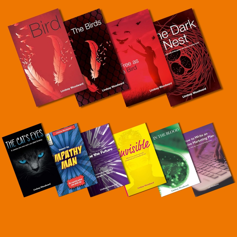
Your book cover is one of the most powerful marketing tools you have. It’s the first thing a reader sees and, without even realising it, they’ll make a judgement on it. In only a split second, they will make decisions on the genre, tone, quality, and whether your story is something they’re likely to enjoy.
That means that people really do judge a book by its cover.
However, all of this doesn’t mean your cover needs to be elaborate or expensive. It just needs to be designed with intention. Here are the top five things every self-published author should consider when creating their book cover.
1. Understand Your Genre Expectations
Every genre has visual cues that readers look for instinctively. For example, romance often uses soft colour palettes, close-up character imagery, or typography-led designs. Fantasy may feature symbolic elements, rich textures or atmospheric scenes, and thrillers tend to lean towards high contrast, bold fonts and striking simplicity.
You don’t have to copy what’s already out there, but you do need to show readers they’re in the right place. If your cover doesn’t match genre expectations, people may not even realise your book is the kind of story they love.
2. Make Sure Your Title Is Clear and Readable
Many readers will first encounter your book as a small thumbnail online. If your title is hard to read in miniature, you risk losing potential buyers. Here are a few things to check before you finalise your cover:
To be clear, it doesn’t mean it has to be boring. It just means you have to purposefully consider the design.
3. Choose Imagery That Supports (Not Competes With) Your Story
It’s tempting to cram as much symbolism into your cover as possible. Some people think that lots of pictures and a full cover is the way to go. But please resist that urge. The best covers are often the simplest. One strong image or motif can be far more powerful than five competing ideas.
Think about what you see when you walk through a bookshop. If the cover is too complex, it’s actually less likely to grab your attention than a book with one, clear impactful image.
If your story features an important object, setting or emotional theme, let the imagery hint at it without giving everything away.
4. Think About How Your Cover Will Look in Print
A cover isn’t just a front-facing image. It might be much easier for ebooks, but for a paperback or hardback, you also need to consider a few other elements. These include:
If your spine text is too small, your book will disappear on shelves. If your back cover looks cluttered, it can cheapen the entire feel.
It’s the little details that elevate a self-published book from “homemade” to “professional.”
5. Wherever Possible, Seek Professional Guidance
You don’t have to spend a fortune, but it’s always a good idea to get guidance from someone who understands design principles. Poorly designed covers can seriously impact sales, even if the writing inside is excellent.
If you have no budget at all and you have no choice but to design the cover yourself, here are some guidelines to follow:
You don’t need perfection. But you do need clarity, confidence, and a design that fits your book’s identity.
Our Support
At Lindie, we guide authors through these decisions, so you avoid overwhelm and you end up with a cover you’re genuinely proud of. You’ve worked so hard on writing it. It would be a disaster to let it down with a poor cover design.
We do offer a cover design service, or we can help with other options to suit any budget. Get in touch to find out more.